UX Case Study: Shazam New Feature

New Bootcamp UX / UI week, new Brief. In this case, the challenge was to take an existing app and add new functionality. This article is the UX process that was done to find the advantages and problems of Shazam, the music recognition application of more than 100 million monthly users, and the UI process to design a new functionality that subtly ties in with the existing design.
Index
ShazamProblemCompetitionUser PersonaUser ScenarioUser StoriesUser FlowStyle TileHigh FiVideo PrototypeAchievementsNext steps
Shazam
Shazam is an app that has been around for a long time, and has been consistent since its creation and launch. There is no other how Shazam and — according to our surveys and interviews — is on everyone’s mind as the leading music recognition application in technology today, and for many even the only.
Problem
Unfortunately like other leading applications, it is not absolved of error. Thanks to our research we managed to find a series of very specific problems that we were going to use as a basis to analyze and devise a new main functionality for the application.
Almost 100% of the people we approached to ask have used Shazam at least once in their life, but less than half of them currently have it installed on their phone, and of those who still have it downloaded. used between 4 and 12 times a year.

We obviously define this as the main problem, the low use of the application, but later we find even more interesting things. Shazam is not only a music recognition application, but it complies with a number of functionalities that allow users to further improve their experience of searching, recognizing and listening to music -as well as augmented reality functionalities to improve the user experience in different contexts. In this way, we realized that people not only used the application very sporadically but that they did not even know the other functionalities that Shazam offered them. And the source of this we realized was a messy information architecture where there was no clear focus on using the application properly, where users sometimes took 1 full minute to find basic functionality, after giving them the instruction for them to do it.
From this we move on.
Competition

With this information we were able to continue with our UX process, and define our User Person, User Journey, User Scenario and User Flow of the new application that we wanted to propose.

User Journey

User Scenario

When the User Scenario was developed, we already knew how the application was going to be developed and designed, the main functionality, we wanted to improve it so that it was faster and its results more accessible to the user through the following changes:
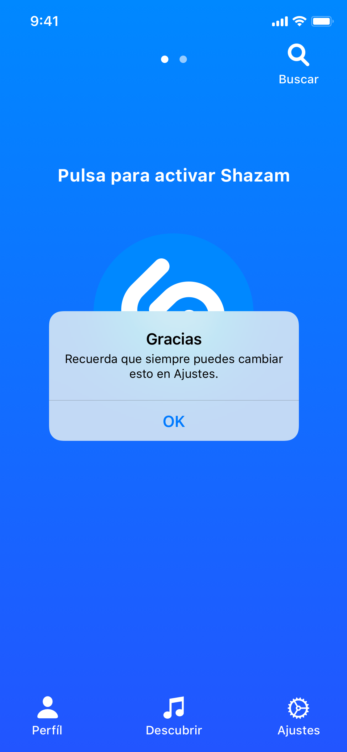
More visibility for the configuration of doing Shazam when opening the application, since the person wasted a lot of time opening and then doing the action, and they were not aware that such a functionality existed.
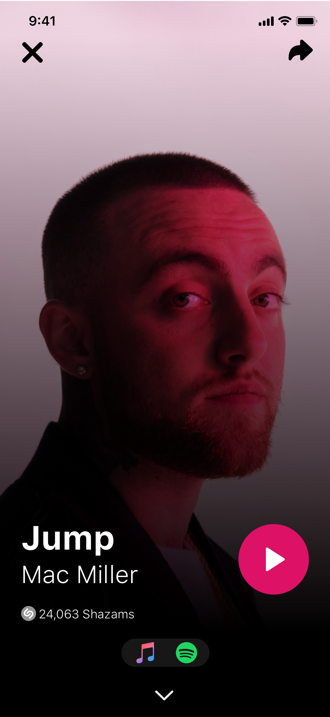
Song suggestions that Shazam offers to the user when it cannot recognize the song at the moment, related to the main song, to offer the user the possibility to decide for himself if the song could be recognized or not, as well as the capacity of the application to save and allow the user to listen to the recording that he had made when listening to the song, so that the user, if Shazam cannot, can search for it himself according to the lyrics, or with the help of someone else.
Finally, redesign of the Information Architecture of the application, so that it would be faster for the user to reach the functionalities that were not even visible before.
User Flow

Style Tile

Prototipo High-Fi


Video Prototipo
Achievements
With this UX UI process we achieve two main objectives:
Enhance the core experience of the app, to make more use of its core functionality, so users were more confident that they could use Shazam when they really needed to recognize a song wherever they were.
Improve the information architecture and make it clearer, so that first the user does not get lost in the application interfaces and secondly, he can see from the beginning what the other functionalities that Shazam offered him were.
Next steps
What we would like to propose for a case study later, to continue working under what we have learned:
Offline actions to offer greater clarity compared to the other functionalities of the application, that is, marketing focused on the fact that Shazam is not just a music recognition app, but much more.
The possibility of recognizing music within social networks, since today it is one of the main sources of information for millions of people. For example an Instagram story, or a video on Twitter.
Finally, allow the user to search and recognize a song from a hum, for when time was not enough to listen to the song itself..
Made in collaboration with Estefania Marchena
Thank you
